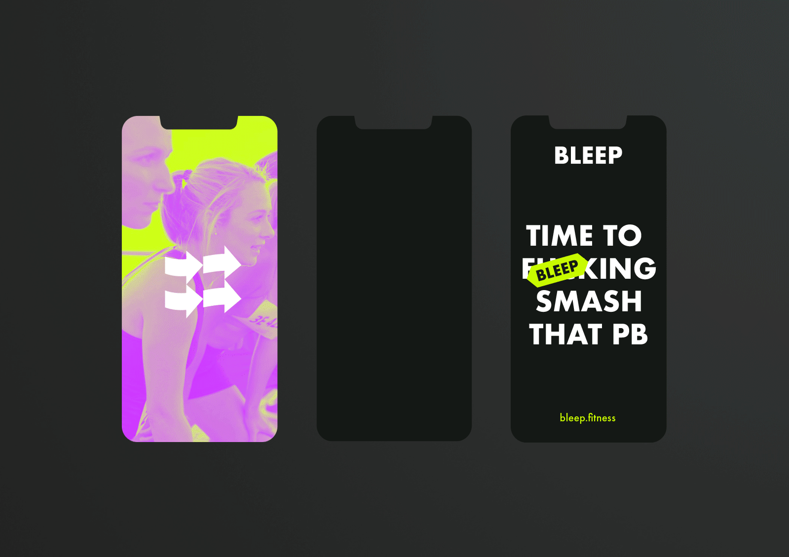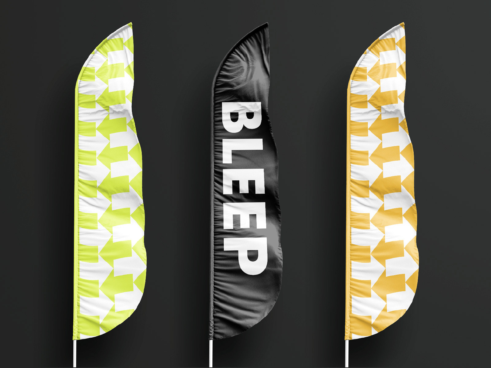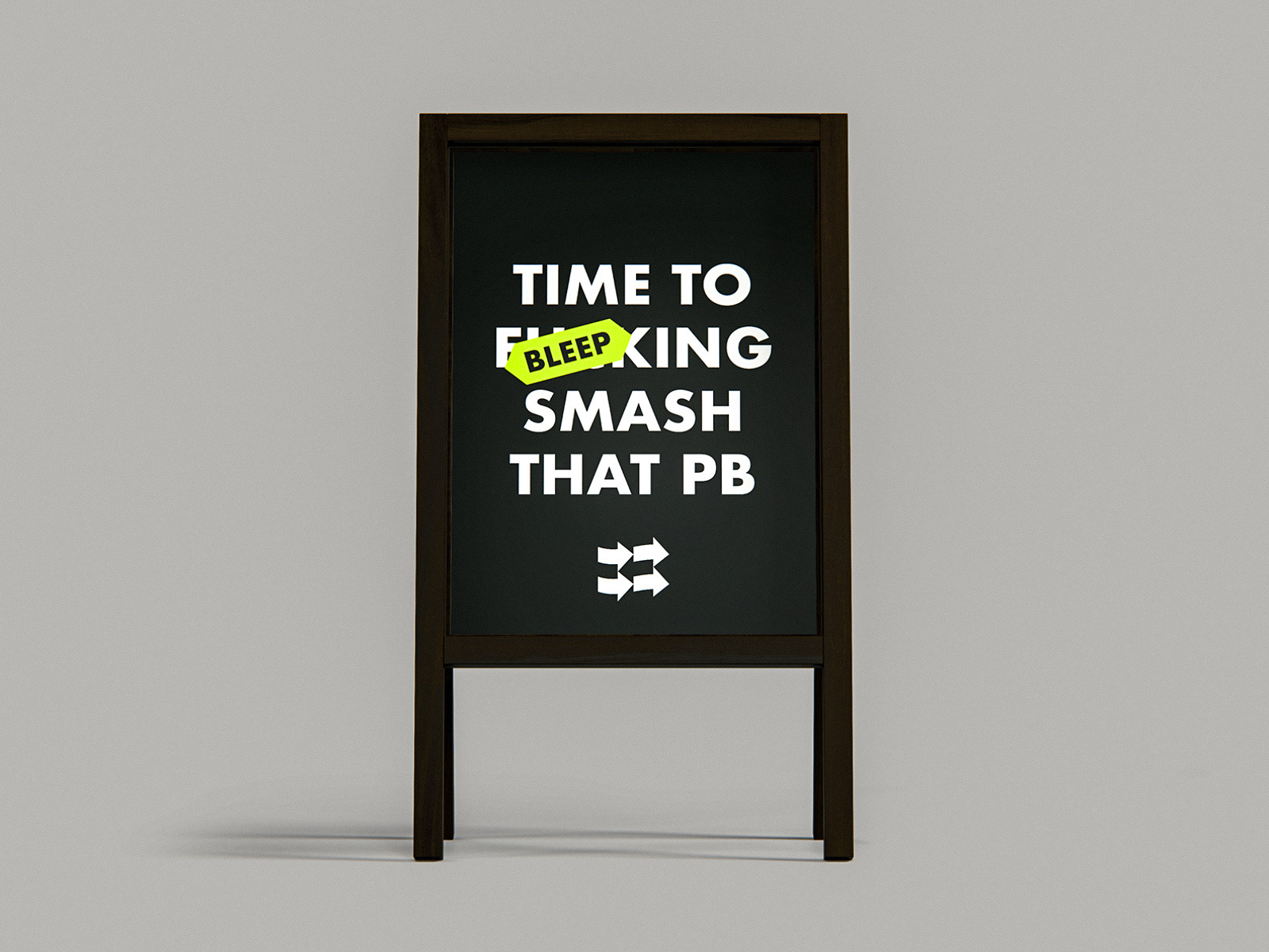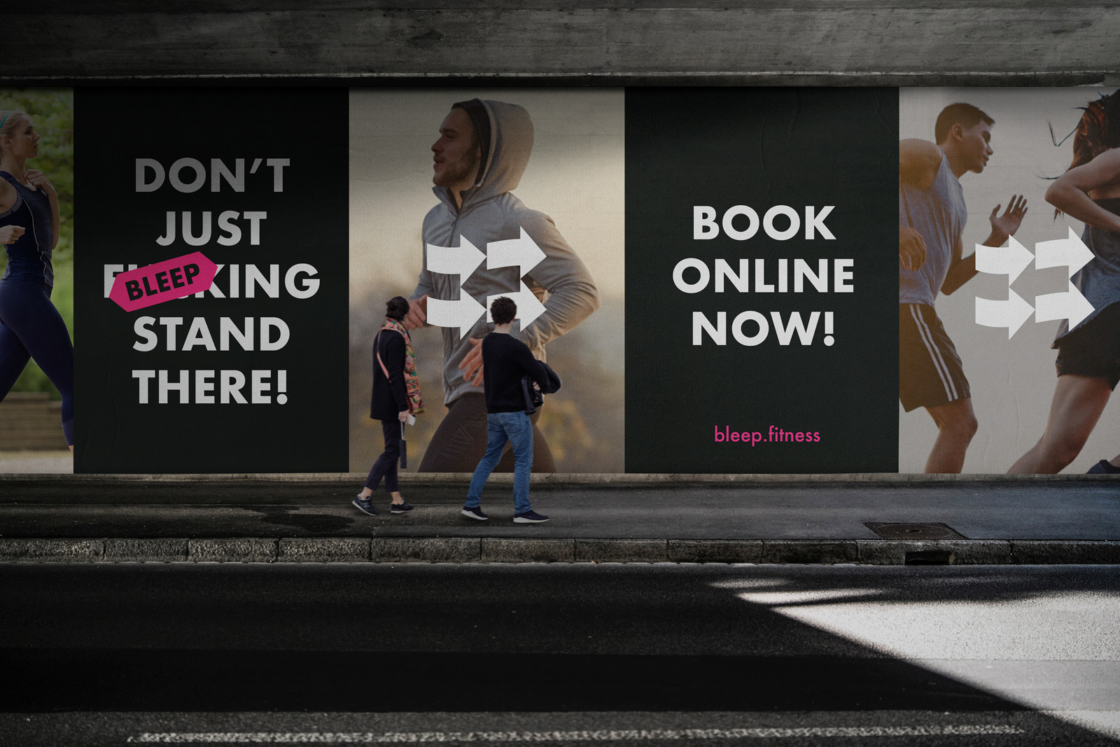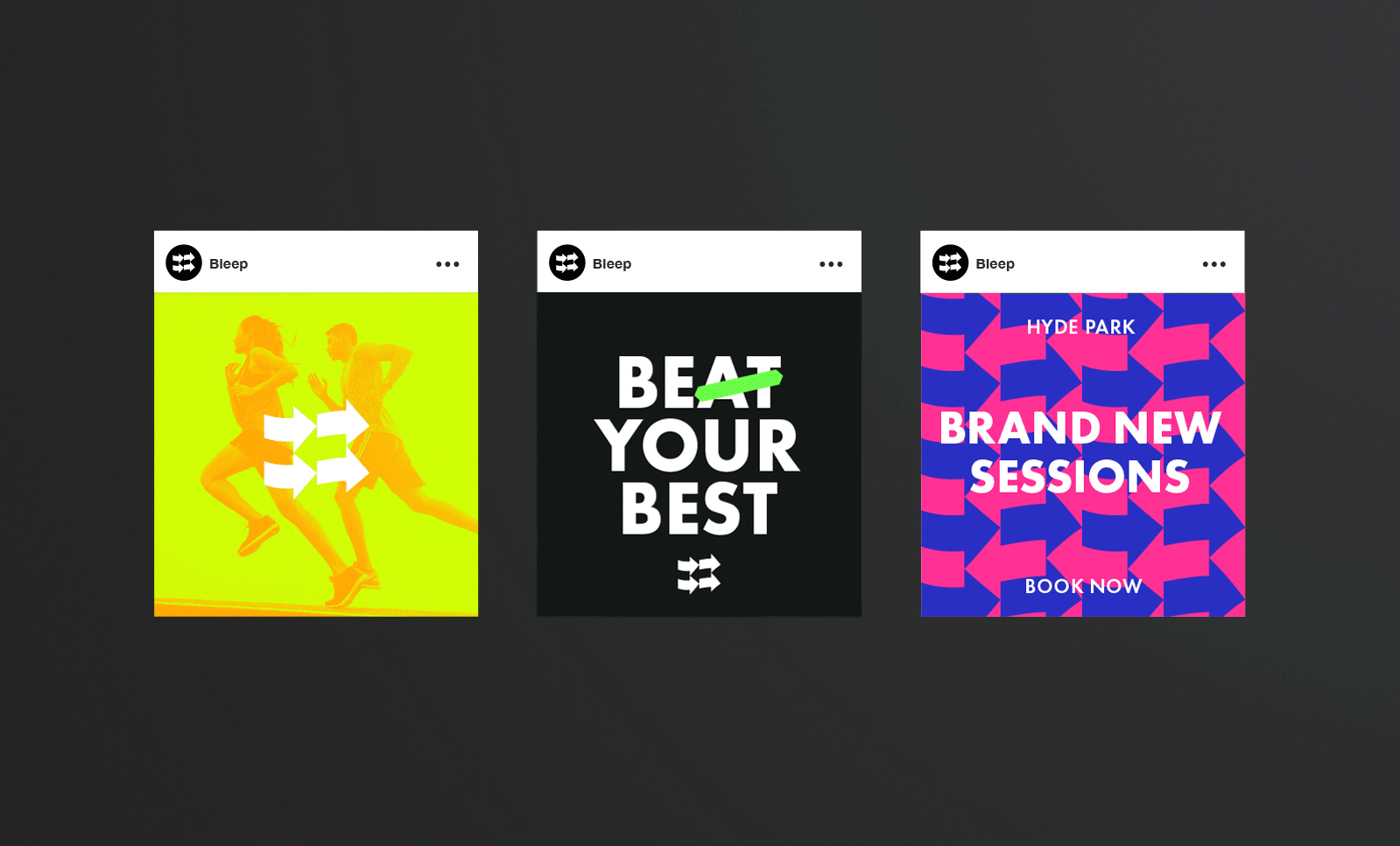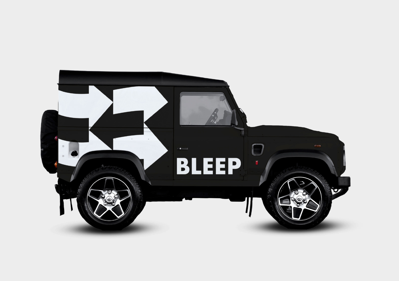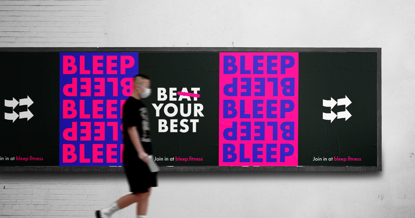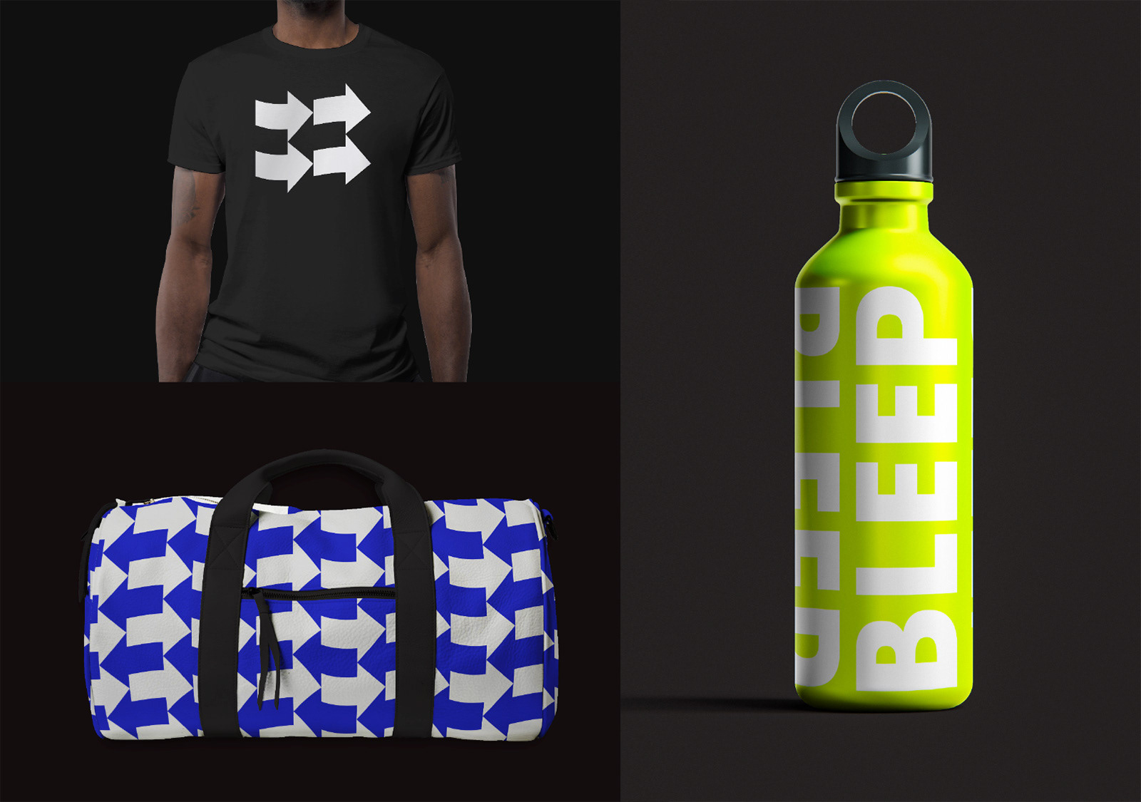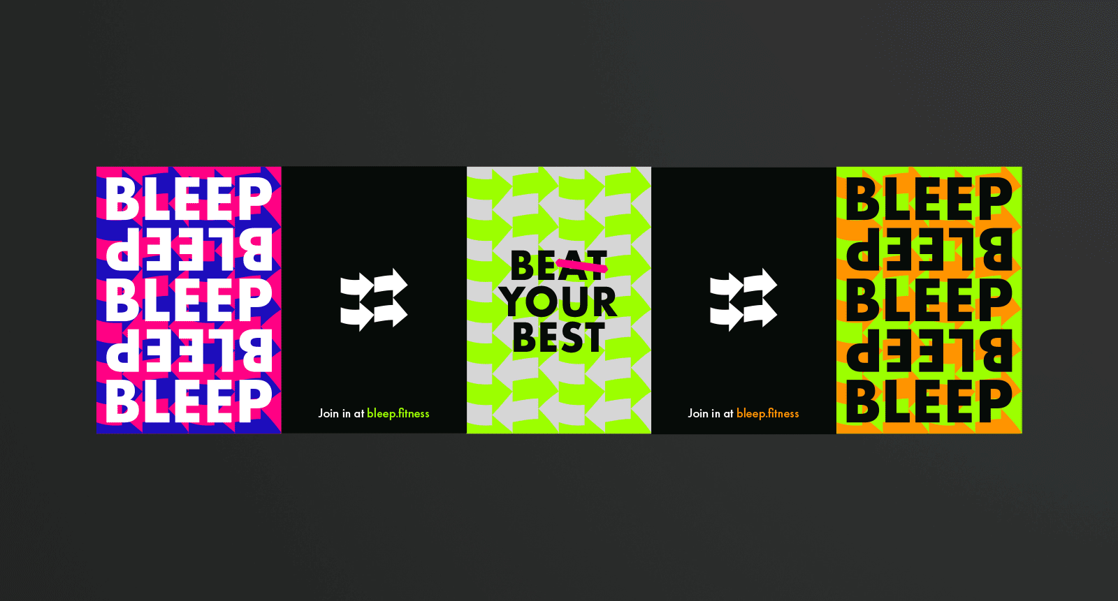

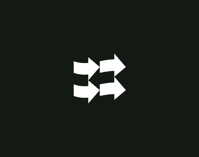
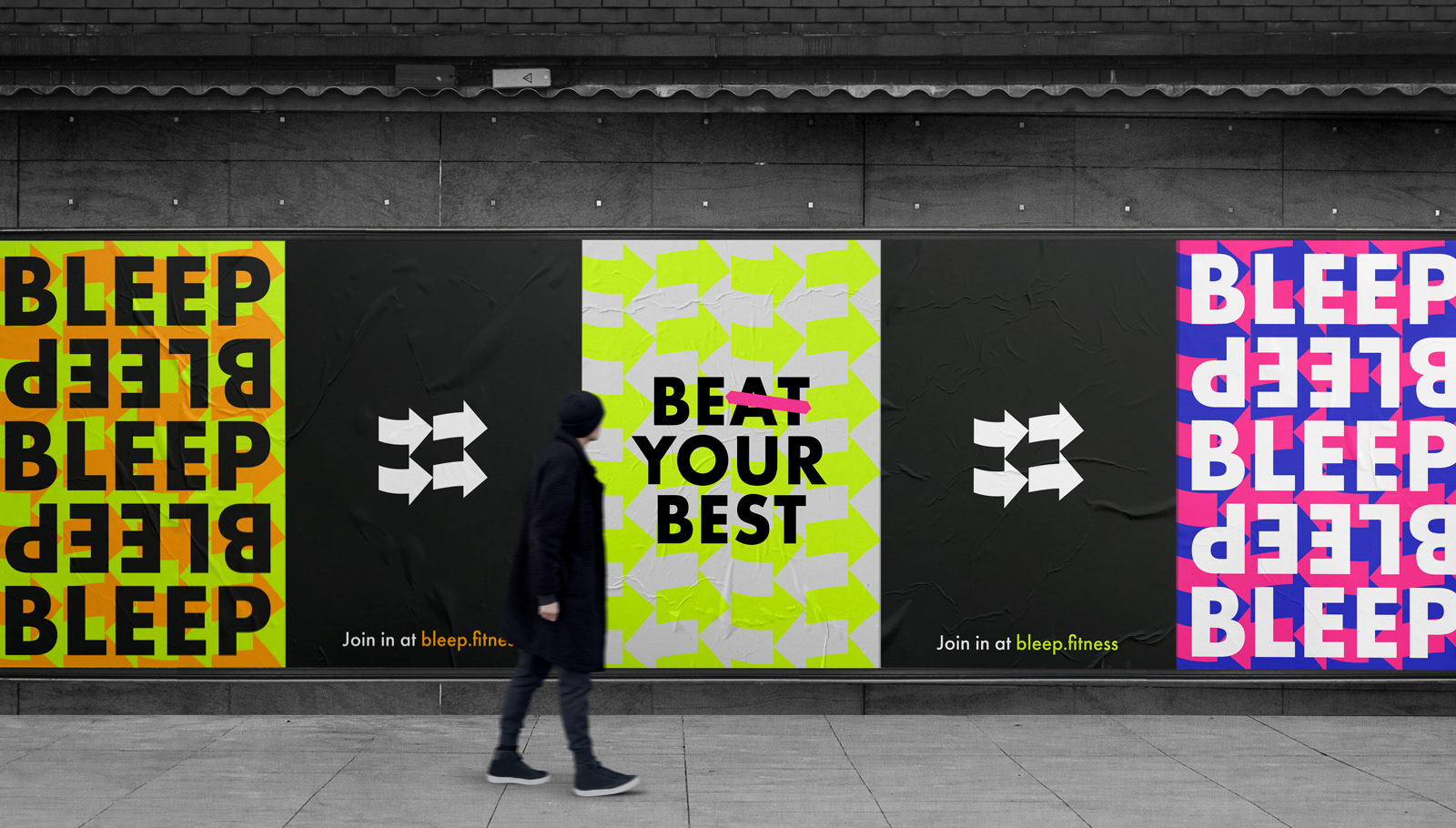
The symbol of arrows pointing in one direction utilises negative space to create another pointing the opposite way, representing the back-and-forth nature of the bleep test.
The same concept is followed across vibrant and colourful arrow patterns (an extension of the logo), and by repeating right-way-up and upside-down versions of the typemark.
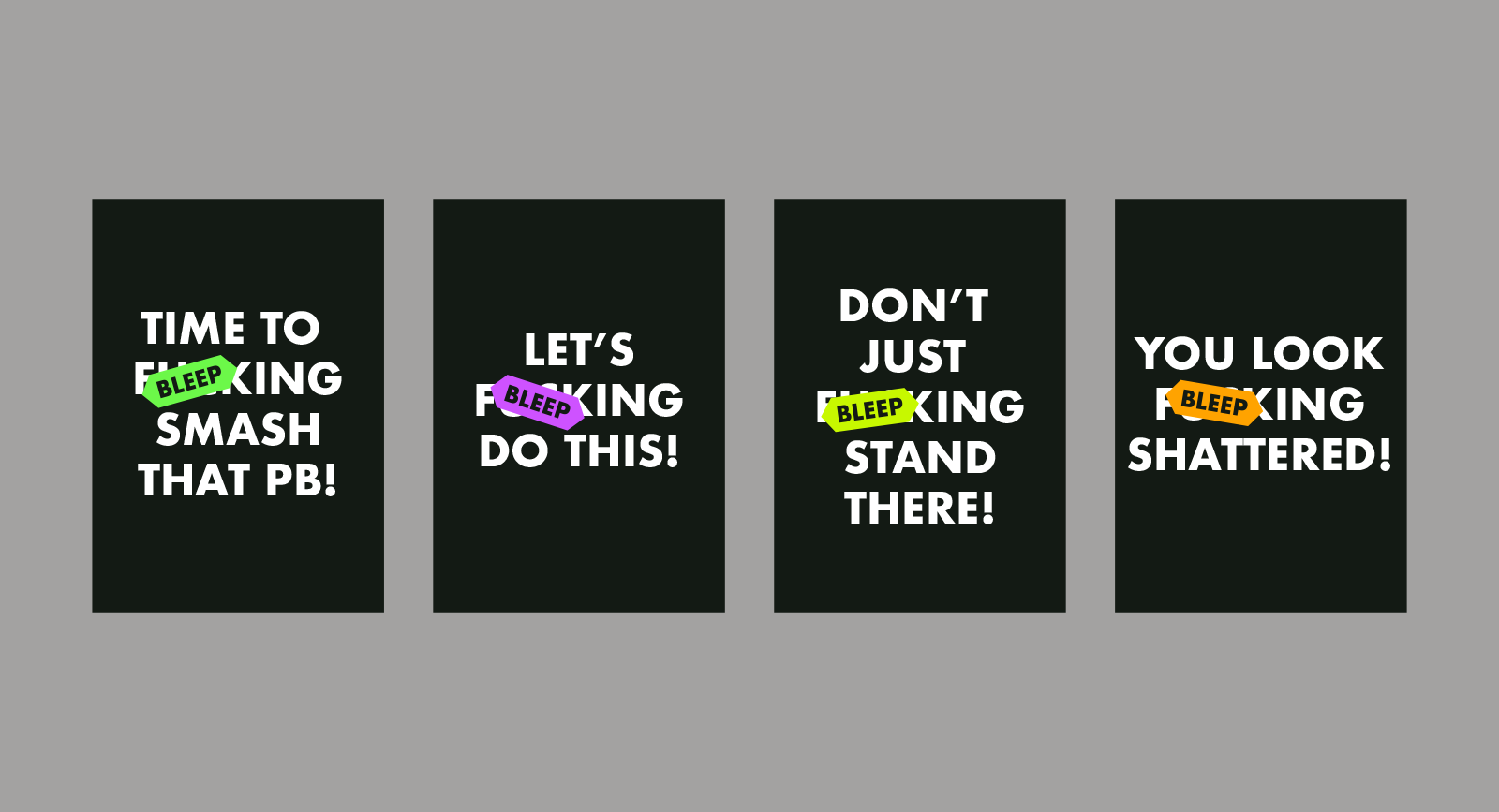
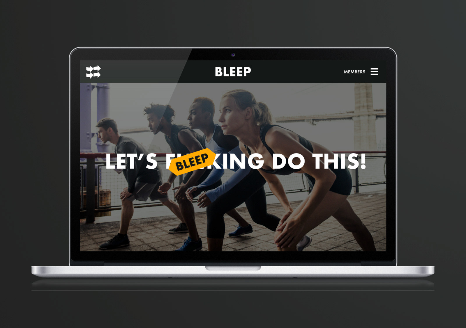
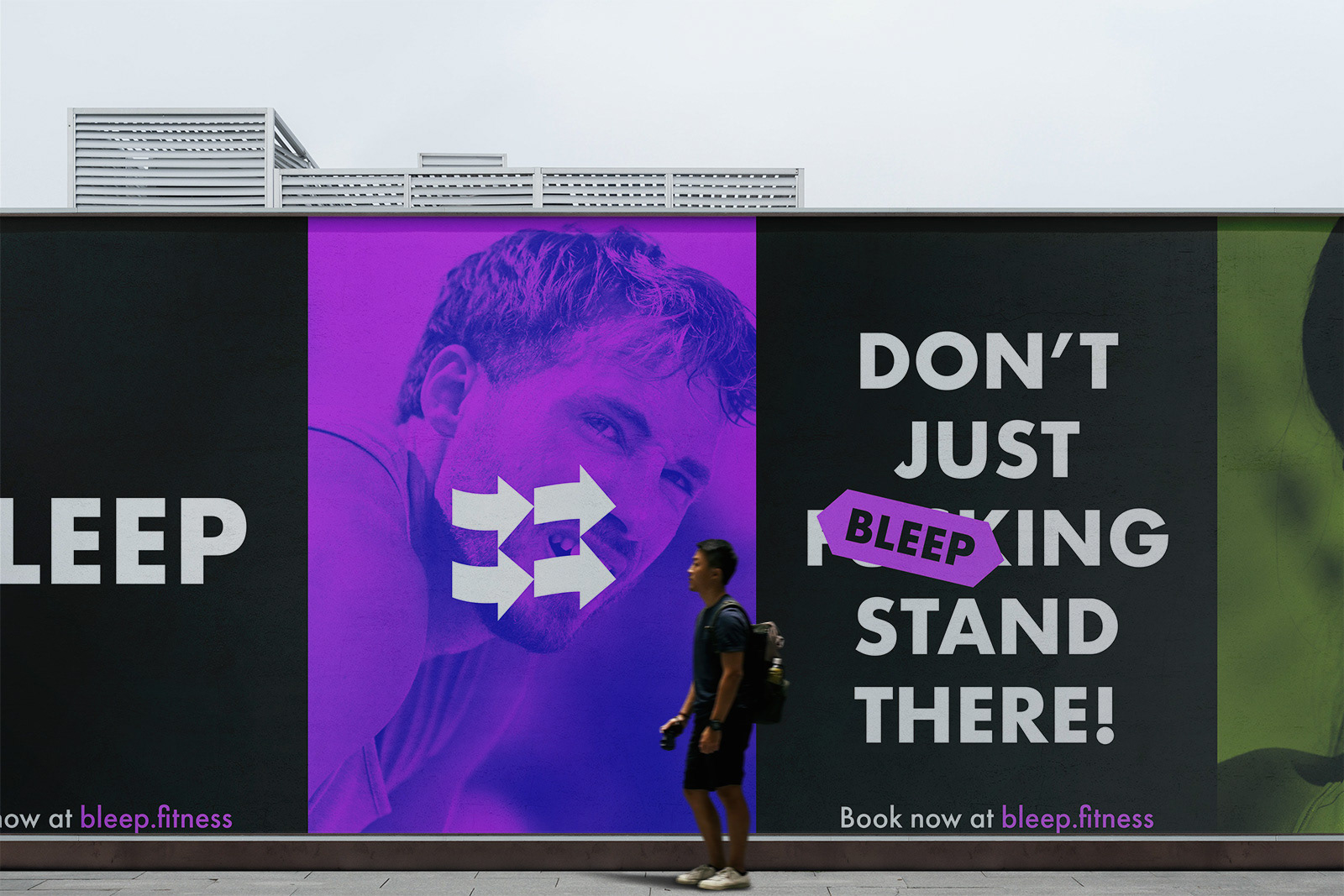
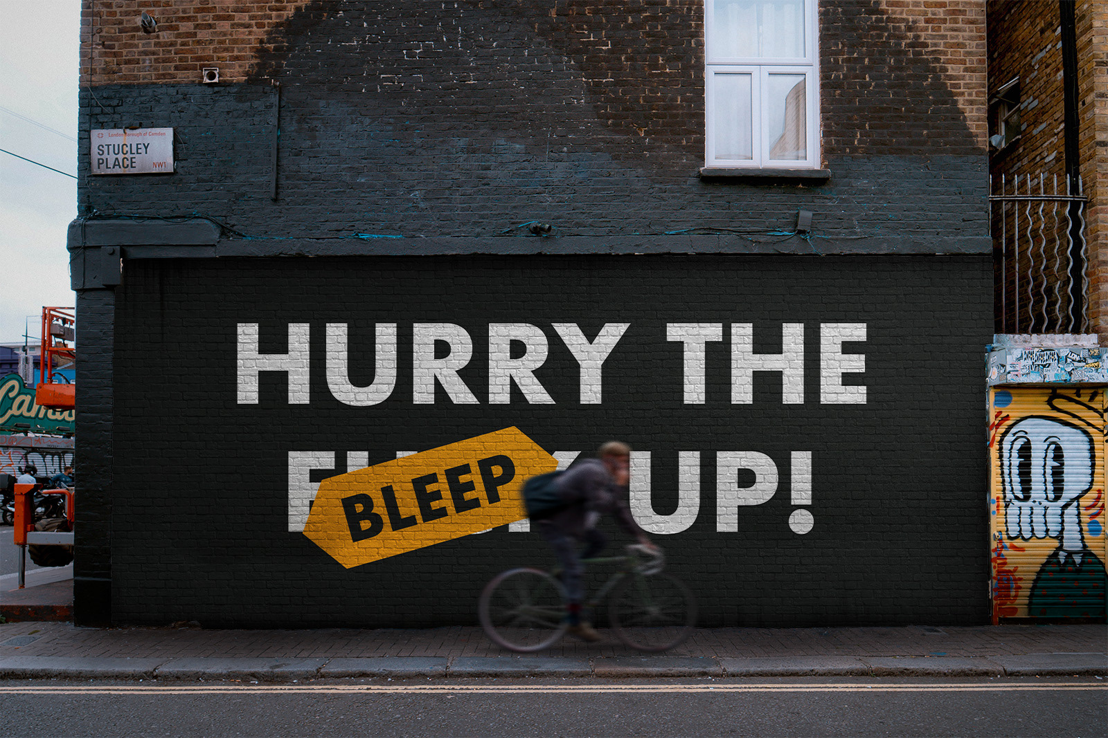
The identity also plays on the name, utilising the typemark as a sticker-like tool to 'bleep out' curse words in bold and attention grabbing messaging.