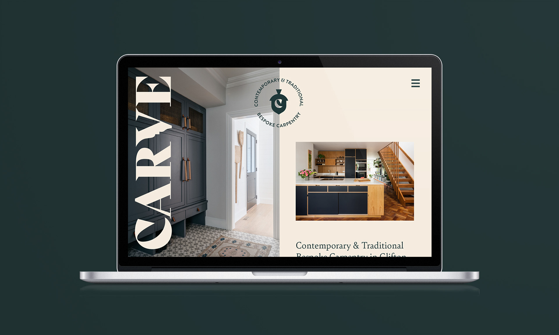


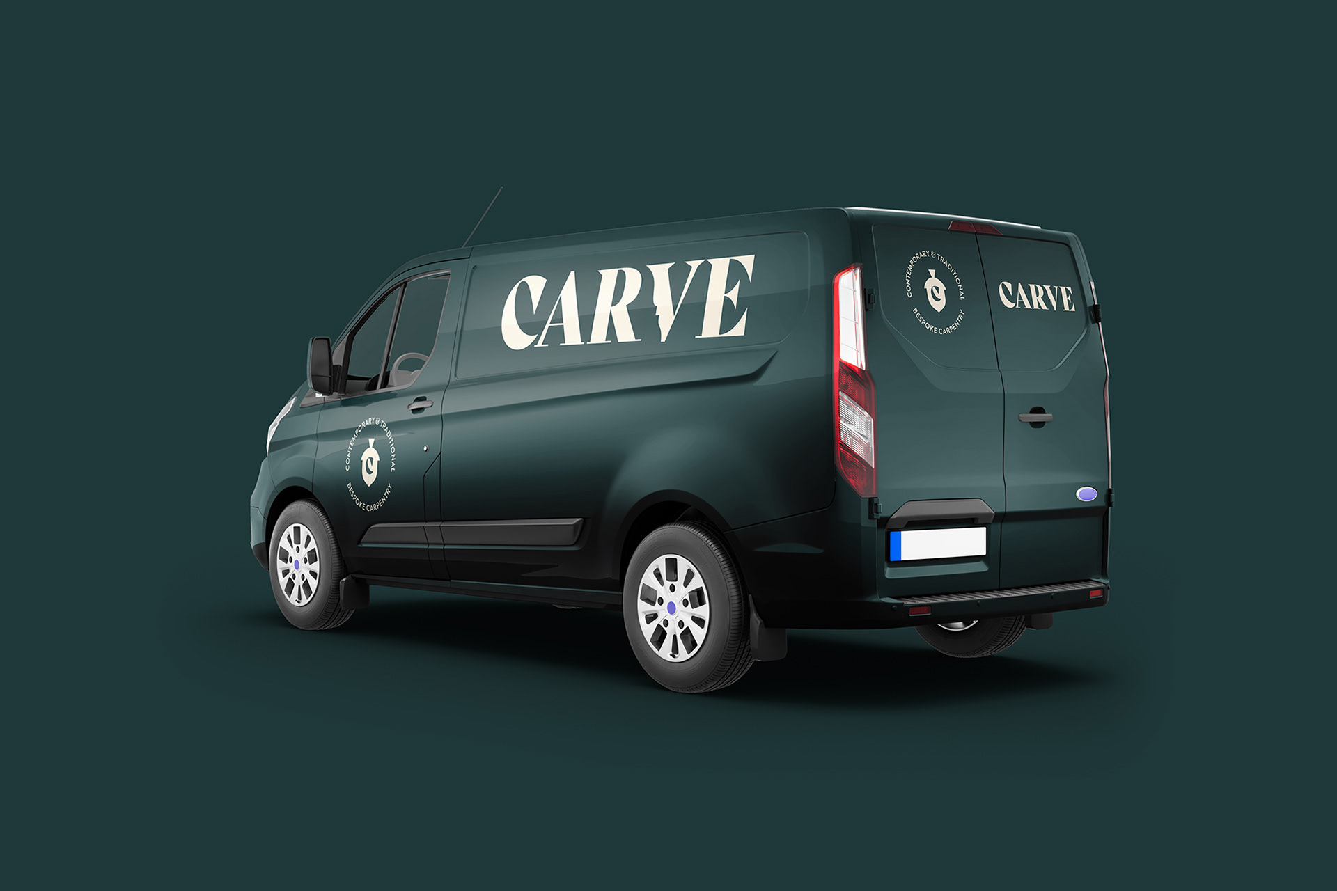
Multiple master assets were created for the brand, allowing the client to only use the more descriptive assets where necessary.
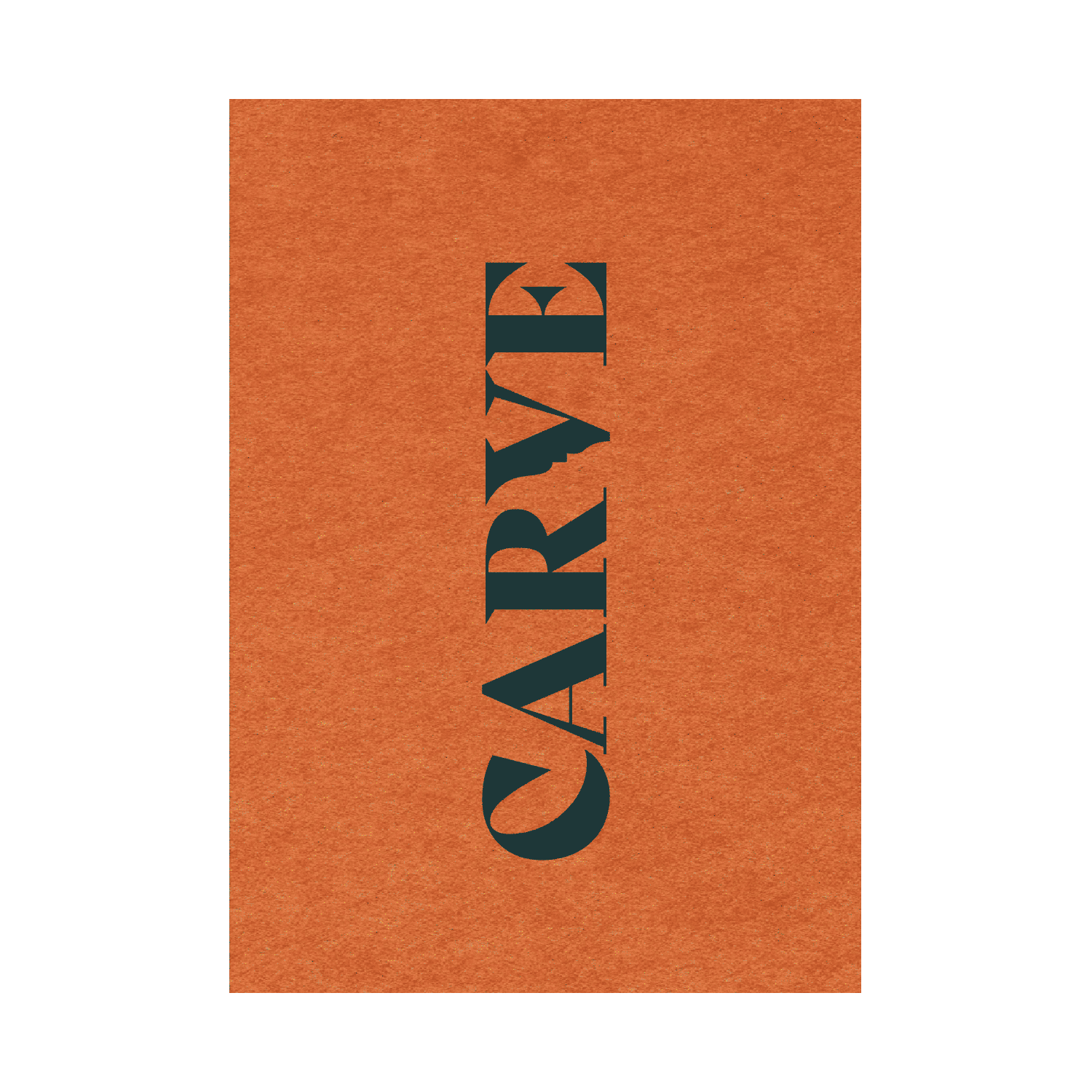
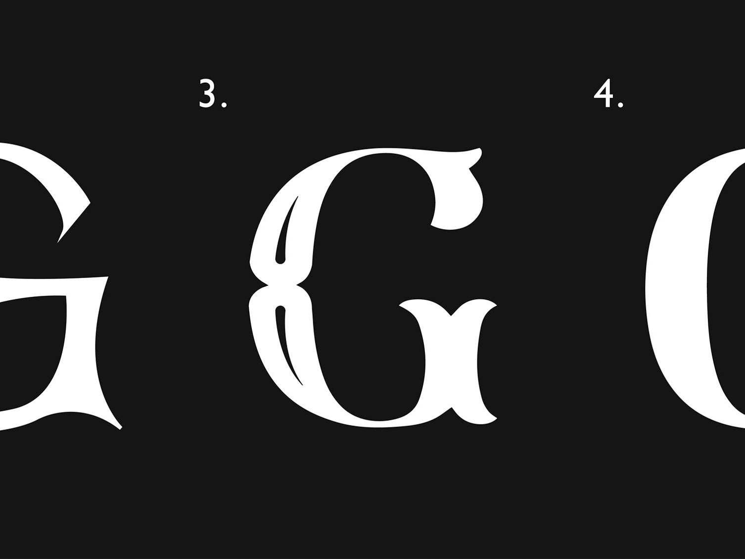
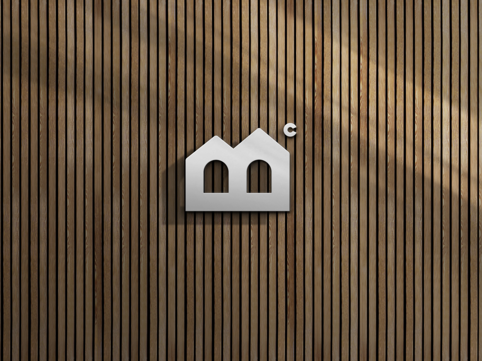
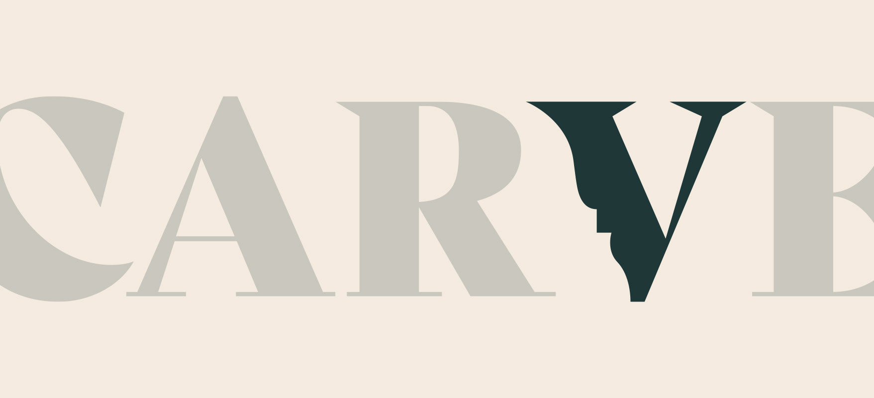
An acorn symbol nods to the use of oak and different types of wood, while there is decorative cornicing 'carved' into the wordmark.
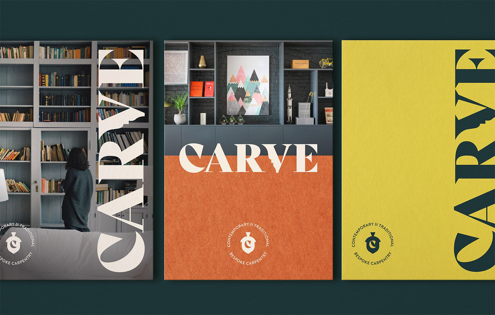


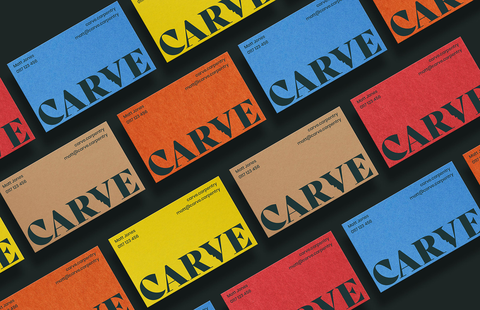
Vibrant colours derived from G.F. Smith's Colorplan range is utilised to create a striking secondary palette for the Carve brand identity.
This ensures printed materials are of a high-quality, through printing directly onto 'the on-brand' Colorplan paper stock.